Pepsi Character Designs
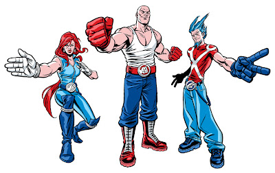
This is a walkthrough tutorial of the steps taken from brief to finished art on a recent character design/illustration job for Pepsi Australia.
1. THE BRIEF
My brief for this campaign was to create three characters to promote an online Rock, Paper, Scissors game on the Pepsi Australia website. The costume designs were also to be used in TV ads (with actors rotoscoped) and the final art was to be used on the Pepsi cans and bottles.
Each character was to represent one of the hand symbols (Rock, Paper, Scissors) and also one of the main Pepsi colours (red, white and blue) and was to have their own distinct personality and look. Originally the idea was to do a parody of professional wrestling characters, with the humour coming from the characters outrageous enthusiasm and outfits, all for a game of RPS. This concept was eventually dropped, but I'll discuss that later.
Here's an abridged version of the brief I received on each character-
"Rock- Colour red, reflecting his temper. Looks like a rock- short, broad, bulky...and bald. Rough and tough as guts. He's crazy, loud and ferocious. He yells and beats his chest. Think The Hulk." The photos accompanying the brief were of masked Mexican wrestlers.
"Paper- The modern white goddess. Snow white hair and cool white outfit. Sexy, attractive. Domineering presence. Think trainer Gillian from The Biggest Loser."
"Scissors- Tall, lean man. Quick and nimble. Wears a tight shiny blue outfit and has 3 foot-high spiky blue hair. Think cool punk with an edge of futuristic appeal. The clever one". During the meeting a comparison with Jim Carrey as The Riddler was mentioned.
Armed with all this information I proceed to the next step.
2. INITIAL ROUGHS
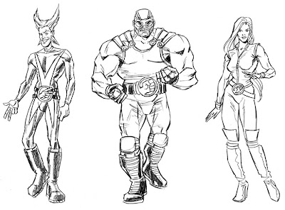 I was off to a pretty good start with the first round of roughs. I integrated the hand symbols into their wrestling belts which carried right through to the final design. Also this version of the female character's outfit remained unchanged for the final as well.
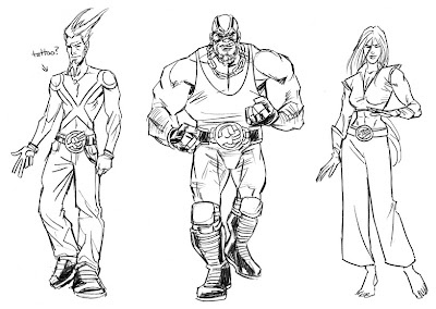 Some alternate designs were also submitted to give the client more of a choice. Baggy jeans were given to Scissors to give him more of a punk aesthetic and also his scissors symbol was suggested as a tattoo. I quite like the female's outfit in this one. The bare abdomen, bare feet and paper-like pants worked well, I thought.
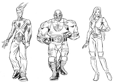 So by this stage, Paper and Scissors outfits' were all done, but there were still issues with the Rock character. They decided to make him stockier and hairier to fit more to the original brief, but they were starting to have doubts about his look altogether. However they decided to proceed to the next phase...
3. POSES
The idea behind the poses was to make their hand symbols the main focus. Since they were to appear fairly small on the cans and bottles, the hands had to stand out and be quite large.
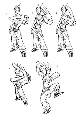 I really liked Scissors' two-fingered, rude gesture pose as it helped put across the punk look they were after, but I guess it was too risque for Pepsi to use. In the end they chose number one.
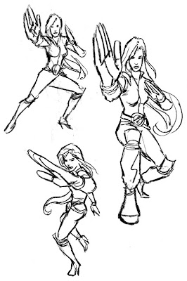 With Paper's hand gesture, a martial arts pose was the most obvious choice. They chose the larger rough on the right and gave me the go ahead to take Paper and Scissors to final pencils.
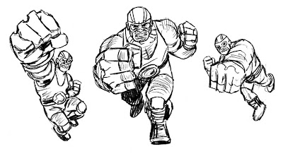 Rock however was still having problems, and these roughs only confirmed the creatives' and client's concerns about the character. So a slightly different approach was requested.
4. BETWEEN A ROCK AND A HARD PLACE
They now wanted a cooler, less ridiculous approach to the Rock character, in a similar vein to the Scissors character.
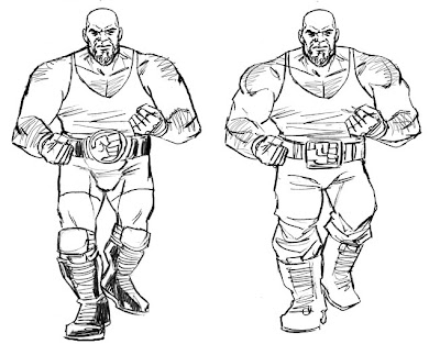 At first they wanted me just to tone down the wrestling aspect, taking off the mask and keeping the outfit simpler.
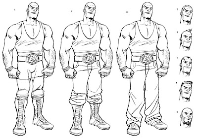 Finally it was decided that the character's aggressive nature had to go, and a more younger 'approachable' character (and clean shaven) was roughed out. Note his selection of groovy hairdos to choose from. The middle version with the bald head was given the green light.
5. FINAL PENCILS (...or so I thought)
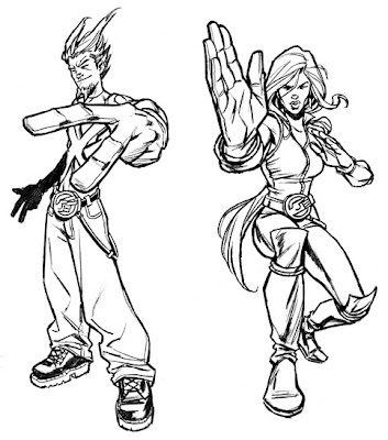 I now proceeded with the pencils for the Paper and Scissors characters based on their previous selections. But upon completion they were concerned that the characters' silhouettes didn't frame the hand symbols well enough. So it was back to the drawing board to make some new roughs with their hands more prominent.
6. MORE ROUGHS
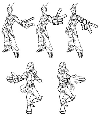 The first of both poses were given the go ahead for final pencils.
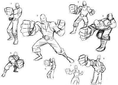 Also, now knowing this new information I produced some more Rock roughs. The final pose used was a hybrid of a couple of sketches.
7. FINAL PENCILS (for real this time)
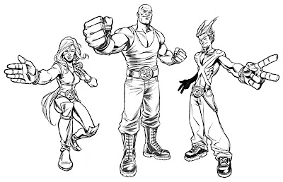 Here are the approved final pencils, complete with the new, happier Rock character. Most of the previous Paper, Scissors pencils were reused with just the addition of new hands...and a less 'squinty' version of the female's face.
8. FINAL INKS
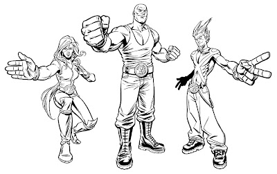 For some reason I thought inking these digitally was going to be a lot quicker. That would be true if I was inking in my rougher inking style, but for these they wanted a more polished inkjob. That didn't stop me though, and only after getting halfway through inking Rock digitally, did I realise I could ink these a whole lot quicker by hand. But 'waste not, want not', I used the digitally inked head and fist and traditionally inked the rest, merging them in Photoshop.
9. COLOUR
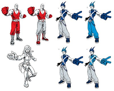 So as mentioned earlier, the original idea was to have each character with their own distinct Pepsi colour. Ideally, the less shades of colour used the better, so to achieve a more iconic look to the characters and to keep printing simple. So it was Red for Rock, blue for Scissors and white for Paper, with grey/silver being used as the secondary colour (skin, clothing etc.). This produced a great looked to the two male characters, but unfortunately Paper let the side down. Having only white and grey to use on her was somewhat limiting and she turned out a bit too bland. A shame really.
Due to the above problem, they decided to let me use any of the Pepsi colours and shades for the characters. I decided to make each characters' glove a distinct colour, as the glove and symbol was the most important element of the pic.
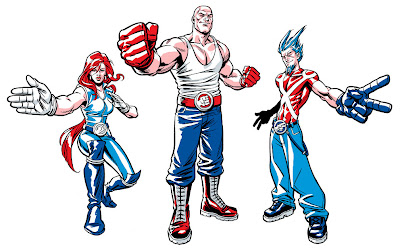 The original lighting setup was a bit too harsh and it was also too complex and detailed for something being printed so small. Also they wanted Scissors' shirt to be less skin tight which meant simplifying his torso muscles.
 So after simplifying the lighting and doing some little fixups, the artwork was vectorized in Illustrator using the Silhouette plug-in. Vectorizing the bitmap image allowed them to enlarge the artwork to whatever size they wanted without losing any of the line quality.
...and here's the finished result.

10. BROUGHT TO LIFE
Here's the television commercial with the characters. The rotoscoped animation was done by fellow Aussie artist, Andy Finlayson.
11. FINAL WORD
As far as character design jobs go, this ran pretty smoothly. So in that respect this tutorial didn't address all the hurdles an artist may face on this kind of job. But hopefully this helped outline the basic structure of the character design process.
Any questions, let me know.


14 Comments:
wow, you must've been happy with how the labels turned out. Interesting read, Chris!
m.
Cool, thanks for the post and a great insight into the process of character design! I really like the Scissors character the most.
Thank you for taking us through your creative process on this design, Chris. You've got some amazing chops, sir - and I applaud you!
Great stuff, Chris! All three characters turned out looking terrific. Gotta be fun to see 'em on labels everywhere, too. :)
And the description of the process is a bonus--thank you for that!
Thanks for the comments. Glad you all found it interesting.
ahh, i've been trying to find who did this.
i've tried to record the add, wich has these dudes in motion, but its not on any more. ah well.
very nice.
e- I've now uploaded the ad to Youtube. It's also embedded in my Pepsi blog entry.
Enjoy!
Hello my name is Robert Shelley,I'm a big fan of your site.I always come here to gather insightful
information on how-tos and incorporate such things in my site.Please consider placing my link on your site. I love devoting myself to the advancement of young minds hungry for the knowledge of comics.When I was a youth I went to the Joe Kubert school of graphic Arts to obtain knowledge from qualified artists because there was no place to learn the great art of comics and cartoons anywhere.It is my mission to instruct and guide those looking for such information.I just started my site a few months ago and have worked very hard to pack it full of learning content,free of charge for everyone,I do it for the sheer joy of doing. I keep it updated with how-to's ,step by step slideshows and video tutorials along with live video when ever possible.Also I have the most up to date comic and cartooning news on the web updated daily also.Anyways I'll cut to the chase,You have a great site full of content and many people come to your site hungry for the knowledge and love of comics and anything you can do to help me promote my site would be sooo greatly appreciated,anything.Content is no good if no one knows where to go to obtain it.My site is at
www.oramaz.blogspot.com and
www.oramaztoons.blogspot.com
Thank you for your time and consideration to this great cause.
Robert P Shelley
Thanks for showing off how these things work. It's a shame that the suits seemed to water down your designs and concepts but they still came out great.
wow what an opporunity working for such a great brand!! you really did well landing that one. congrats!
can someone tell me whether pepsi ever launched any drink with green colour?????
Very cool job
Brilliant work - I really love the designs and enjoyed reading your process. Thanks for sharing this. It's a great insight to what I am starting on at the moment too.
All the best.
Yoni
This type of info is vital in improving skills as illustrators thanks again and guess what just got my first commissions in cheers, again Chris for the advice top bloke!
Post a Comment
<< Home