Charlie Sheen Tutorial
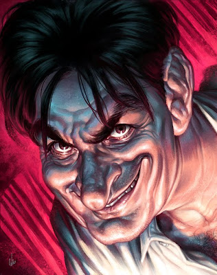
Below I'll describe from start to finish the stages I went through to create this Charlie Sheen caricature for Australian FHM magazine. This is more of a step-by-step rather than a tutorial but you should get some idea about my creation process. To cap it off at the end there's an animated gif of the painting.
1. ROUGHS
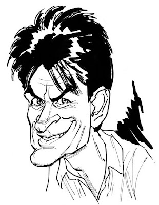
I started off with a quick caricature of Sheen just to warm up and get familiar with his features so I could sketch him from memory in the next stage.
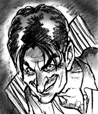
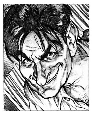
I only did one initial rough to show the client as I had a clear idea in my head of what I wanted to do, so doing more roughs seemed like shooting myself in the foot. Saying that, I was fully prepared to sketch up more ideas if the art director requested it. Luckily for me though, he liked this idea but asked me to crop in tighter so Sheen's face was more in the centre and there wasn't so much emphasis on his hair.
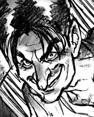
Above is the cropped rough and below is the approved refined pencil rough going for a better likeness. I knew I was on the right track with the likeness when my six year old saw it and started singing the 'Two and a half men' theme tune.
2. GIRLS, GIRLS, GIRLS!
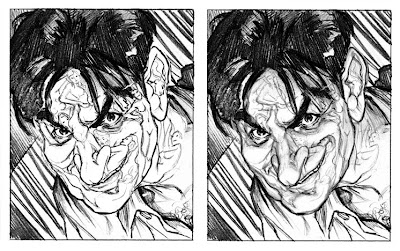
I forgot to mention, the reason the art director was so quick to approve the first rough was due to an idea I wanted to explore with the Sheen caricature.
The Sheen article in the mag was about Sheen's womanising, drug taking and sometimes violent tendencies (and how he still manages to be a big, bankable star). So, the idea was to have Sheen's facial features made up of a mass of writhing female bodies which shaped to the contours of his face. Being FHM magazine, incorporating women into the pic would have been appropriate (and most likely appreciated by the readership). But, I always stressed to the art director that there was a chance that I wouldn't be able to pull this idea off (and quite obviously I wasn't) and that if I thought doing this would mean sacrificing the Sheen likeness then it would be abandoned (and it was). But here is an indication of how it could have looked if I had more time, more skill, and as the next step will show, better photo reference...
3. REFERENCE...or lack thereof.
There were three reasons why this job was tough enough without the added difficulty of incorporating a sea of women into his face.
The problem was the approved sketch I drew of Sheen wasn't based on an existing photo. I didn't have a) a photo of Sheen with his head at that exact angle, b) with that expression and most of all c) with that dramatic underlighting. If I did have all three of those I probably would have been more confident about doing the women, but I was facing an uphill battle as it was.
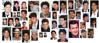
I'd gathered a mass of photo ref of Sheen from the internet, some had the expression I wanted but not the angle, and vice versa. So during painting I went back and forth amongst the multiple photos to make sure everything was right with the likeness.
Those with sharp eyes will notice a Kruger caricature of Steve McQueen in amongst the reference. This was there for inspiration.
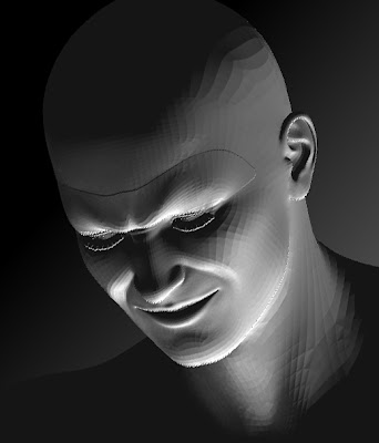
For lighting I posed a Dazstudio 3D model in Zbrush so I had accurate reference for the sinister underlighting I was after.
4. ...AND THE REST.
I thought about a few different ways of approaching this painting. One was my usual way of doing a detailed shaded pencil to give a good foundation, but I was feeling brave so I decided to start painting right over the top of my approved sketch.
This was all painted in Photoshop. The smudge tool was used to blend the rough sketch lines into the colour, then I just built the detail up from there using Photoshop brushes and my custom texture brushes. The animated gif below should give you a good indication of the painting process.
Hope this was insightful. Any questions let me know. Enjoy!
38 comments

Einstein

A digital sketch of Albert Einstein specifically done for Illustration Friday's current topic, 'Theory'. Einstein of course being the creator of the theory of relativity.
Below is a video of the sketch done in Painter X. Painter's very useful for this as there's a saveable script which can record all your brushstrokes for playback.
The music is 'Buy me a pony' by Aussie band, Spiderbait. Enjoy!
New and improved Girl sketch video
19th Feb 2008- After recently adding an Einstein video with music to the tutorial section, I decided to update some of my previous videos. First up are my two girl sketch videos which have been combined here into one with some rockin' music added. A lot more snazzy now, don't ya think?
The music is 'Going outta my head' by Spiderbait.
The original links for the girl videos (without music) have been taken down from the Tutorial section but I've provided the links below.
Girl inks
girl colour
The music is 'Going outta my head' by Spiderbait.
The original links for the girl videos (without music) have been taken down from the Tutorial section but I've provided the links below.
Girl inks
girl colour
Penguins- Combining 3D and 2D
 In this tutorial I will explain how I combined three dimensional elements created in a 3D modelling program (in this case, Zbrush), and combined them with 2D painting techniques and texture overlays in Photoshop to achieve a hybrid of the two.
1. THE BRIEF
This was for MLC, a superannuation firm here in Australia. The idea behind the Illustration was to show a person's (in this case a penguin's) 'nest egg' growing with their particular super fund.
The company's colours, a gold and purply-blue were to be integrated into the colour scheme of the illo. So the snow and sky would both have a purply tinge to it, combined with the gold sunset.
2. THE ROUGH
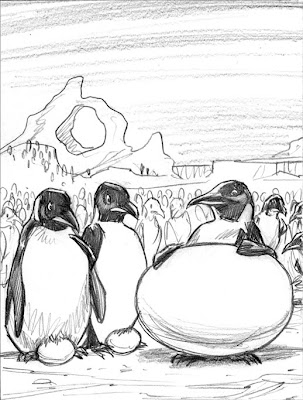 As always this job started with a pencil rough. They gave the go ahead without any changes, but their quick approval was to cause problems later on.
3. 3D/2D COMBO
The reason for combining the two approaches was to get the best of both techniques but without any of their time consuming elements. This was completed in a couple of days, so I didn't have the time to model and texture 3D penguins to the level of detail I wanted and I also wouldn't have been able to achieve this result just through 2d digital painting either. So a combination of the two seemed the best way to go.
4. ZBRUSH
The 3D modelling program I used for this was ZBrush (which technically is a 3D/2D program in itself). The basic shapes for the ground, eggs, ice formations and penguins were all modelled in this program. Usually in a 3D application the next step would be to add textures and assign bump maps etc to complete the 3D look, but as mentioned these bare models were just assigned lighting then rendered just as plain greyscale images and then exported to Photoshop for further work.
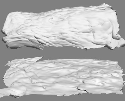 The ground (above) was modelled using a flat plane, which was assigned an alpha mask (this creates a mask based on a texture's greyscale intensity, darker bits are masked while lighter bits aren't) after some deforming I ended up with these snow scenes.
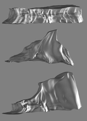 The ice formations started as 3D spheres, cubes and torus shapes which were then manipulated like clay (a trait that Zbrush is well known for) to achieve their particular looks.
The egg was a basic sphere slightly deformed to get the egg shape. I assigned the egg a simple eggshell material before rendering.
The lighting setup for rendering, used about four lights to achieve the bouncing of light on a snowfield.
5. INTO PHOTOSHOP
So in Photoshop I colourised and lightened the models to get the particular icy look I was after. On the ground I overlayed a grainy texure to emulate the texture of snow. I made sure I transformed the perspective of the texture to match that of the ground.
Another texture was overlayed onto the egg to give it more depth.
The sky was a simple gradient incorporating the company's colours. The clouds were airbrushed wisps in Photoshop which were stretch and distorted and then assigned an embossed layer style to give the underside lighting.
6. THE PENGUINS
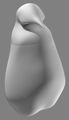 In Zbrush, a simple penguin shape was created using Zspheres. The same lighting setup was applied and it was exported to Photoshop. The seam around the chest area was cleaned up, then it was ready to paint.
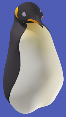 On a separate layer, colours were painted onto the shape below. With the layer set on overlay, this allowed the rendered shading to show through.
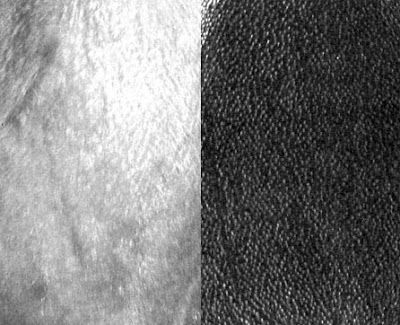 Scanned textures from photos of penguins were used as a quick shortcut to achieve a realism to the penguins. The constrast was increased on the greyscaled textures, and posterize was used to give the photo textures a slightly more painterly feel.
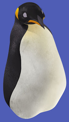 On a separate overlay layer again, the stamp tool was used to brush on the textures. Applying textures in Photoshop instead of a 3d program had it's pros and cons. The bad thing is I didn't have the textures contouring to the model's shape as they would in a 3D program, the good thing was I didn't have to created a seamless texture (which is what's usually used in 3D art) and in PS it was quicker to apply the texture where I wanted it. Once again the best results in the least amount of time was needed.
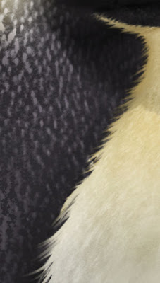 The little wisps of hair were created using Photoshop's smudge tool. To achieve a similar effect in a 3D program would have taken a hell of a lot longer.
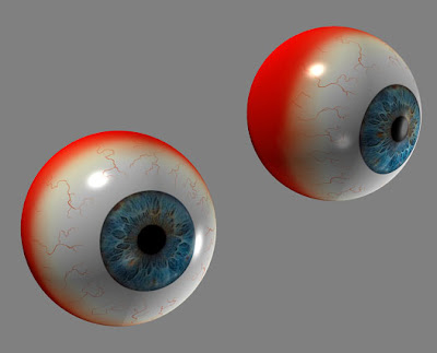 These eyeball I've reused time and time again for various projects. Back in ZBrush, I positioned the eyes in the rough position of where they might fit onto the penguin's face. This was then rendered and exported out.
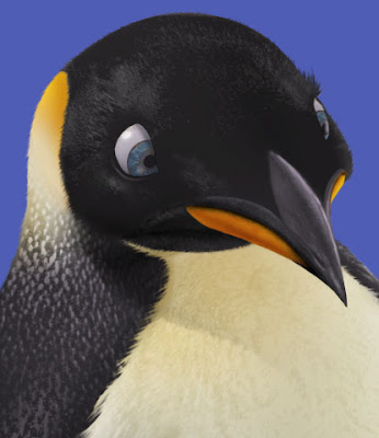 The eyes were just overlayed onto the painted eye portion, with a bit of shadow being added to make them sit more convincingly.
Also at this point I painted more detail into the beak, fixed up the shape slightly and overlayed a rough texture.
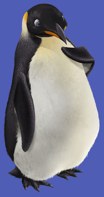 The flippers, feet, tail and shadows were added, all painted in Photoshop.
The penguin was finished.
7. CLONES!!
Luckily penguins all look pretty similar to each other. Creating twenty unique penguins from scratch would have taken forever, so using the first penguin, I cloned it making adjustments to each one (using the very useful PS liquify tool) to give them a little bit of their own personality (different eye colours, different shaped heads and bodies). Lighter and bluish tones were added to the penguins as they receded into the background (emulating the effect of fog and atmosphere.), this also helped to make the main characters 'pop'.
Shadows were created for all the eggs and penguins to make them sit more convincingly in their environment.
Finally a layer of noise was added to the whole piece to get rid of the digital feel.
8. THE RESULTS
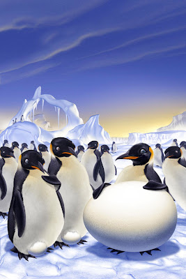 The first version sent through, followed the original pencil rough very closely. However they weren't keen on the ice arch, and wanted to exaggerate the expressions and poses more on the penguins, so some changes were made.
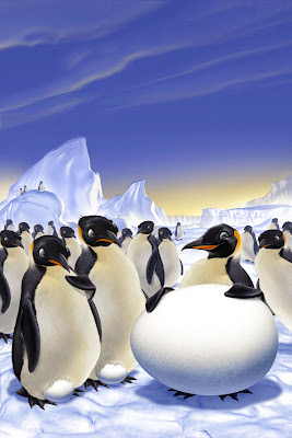 This is where the Liquify tool came in handy again. It was very simple to nudge the expressions on all the penguins, exaggerating them more where needed. Since everything was still on layers, the arch was removed, replaced by the mountain behind it which was enlarged and placed higher. Total time for all changes about 3 hours.
 They also requested a separate version with 99% of the background penguins removed so to place more emphasis on the main characters. Luckily I'd rendered all the ground around so some nice bits of snow ended up showing through. Also the clouds were removed to help the added text stand out more.
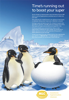 Here's how the final image appeared in print. They obviously no longer wanted the company colours in the piece, so they got rid of the purple and gold hues and gave it a more icy look. Turned out pretty good. It's just a shame that so much of what I added was taken out in the end.
Hopefully, this tutorial has shed some light on another aspect of my illustration work. Once again questions are always welcome.
Pepsi Character Designs
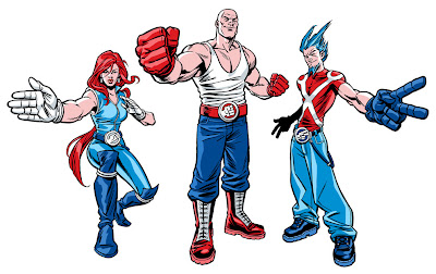
This is a walkthrough tutorial of the steps taken from brief to finished art on a recent character design/illustration job for Pepsi Australia.
1. THE BRIEF
My brief for this campaign was to create three characters to promote an online Rock, Paper, Scissors game on the Pepsi Australia website. The costume designs were also to be used in TV ads (with actors rotoscoped) and the final art was to be used on the Pepsi cans and bottles.
Each character was to represent one of the hand symbols (Rock, Paper, Scissors) and also one of the main Pepsi colours (red, white and blue) and was to have their own distinct personality and look. Originally the idea was to do a parody of professional wrestling characters, with the humour coming from the characters outrageous enthusiasm and outfits, all for a game of RPS. This concept was eventually dropped, but I'll discuss that later.
Here's an abridged version of the brief I received on each character-
"Rock- Colour red, reflecting his temper. Looks like a rock- short, broad, bulky...and bald. Rough and tough as guts. He's crazy, loud and ferocious. He yells and beats his chest. Think The Hulk." The photos accompanying the brief were of masked Mexican wrestlers.
"Paper- The modern white goddess. Snow white hair and cool white outfit. Sexy, attractive. Domineering presence. Think trainer Gillian from The Biggest Loser."
"Scissors- Tall, lean man. Quick and nimble. Wears a tight shiny blue outfit and has 3 foot-high spiky blue hair. Think cool punk with an edge of futuristic appeal. The clever one". During the meeting a comparison with Jim Carrey as The Riddler was mentioned.
Armed with all this information I proceed to the next step.
2. INITIAL ROUGHS
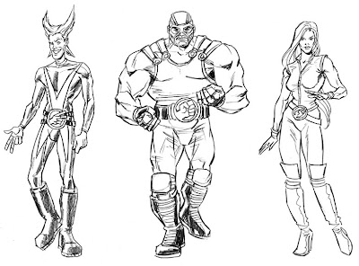 I was off to a pretty good start with the first round of roughs. I integrated the hand symbols into their wrestling belts which carried right through to the final design. Also this version of the female character's outfit remained unchanged for the final as well.
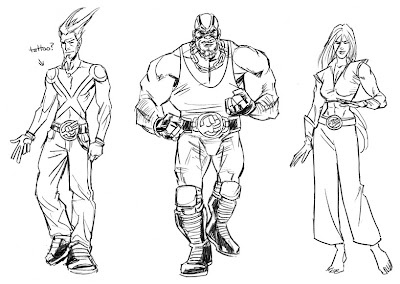 Some alternate designs were also submitted to give the client more of a choice. Baggy jeans were given to Scissors to give him more of a punk aesthetic and also his scissors symbol was suggested as a tattoo. I quite like the female's outfit in this one. The bare abdomen, bare feet and paper-like pants worked well, I thought.
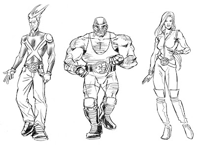 So by this stage, Paper and Scissors outfits' were all done, but there were still issues with the Rock character. They decided to make him stockier and hairier to fit more to the original brief, but they were starting to have doubts about his look altogether. However they decided to proceed to the next phase...
3. POSES
The idea behind the poses was to make their hand symbols the main focus. Since they were to appear fairly small on the cans and bottles, the hands had to stand out and be quite large.
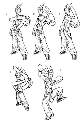 I really liked Scissors' two-fingered, rude gesture pose as it helped put across the punk look they were after, but I guess it was too risque for Pepsi to use. In the end they chose number one.
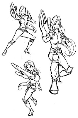 With Paper's hand gesture, a martial arts pose was the most obvious choice. They chose the larger rough on the right and gave me the go ahead to take Paper and Scissors to final pencils.
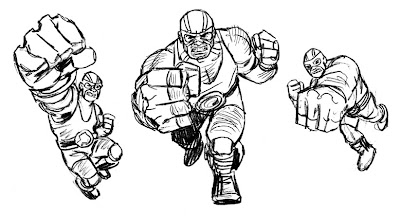 Rock however was still having problems, and these roughs only confirmed the creatives' and client's concerns about the character. So a slightly different approach was requested.
4. BETWEEN A ROCK AND A HARD PLACE
They now wanted a cooler, less ridiculous approach to the Rock character, in a similar vein to the Scissors character.
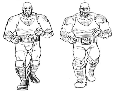 At first they wanted me just to tone down the wrestling aspect, taking off the mask and keeping the outfit simpler.
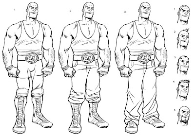 Finally it was decided that the character's aggressive nature had to go, and a more younger 'approachable' character (and clean shaven) was roughed out. Note his selection of groovy hairdos to choose from. The middle version with the bald head was given the green light.
5. FINAL PENCILS (...or so I thought)
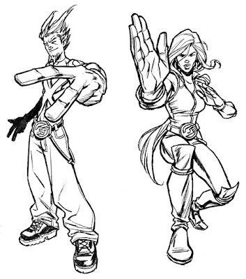 I now proceeded with the pencils for the Paper and Scissors characters based on their previous selections. But upon completion they were concerned that the characters' silhouettes didn't frame the hand symbols well enough. So it was back to the drawing board to make some new roughs with their hands more prominent.
6. MORE ROUGHS
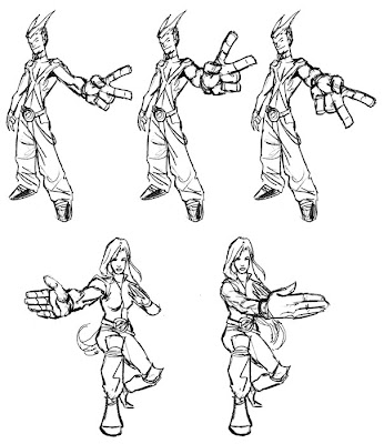 The first of both poses were given the go ahead for final pencils.
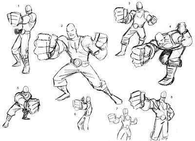 Also, now knowing this new information I produced some more Rock roughs. The final pose used was a hybrid of a couple of sketches.
7. FINAL PENCILS (for real this time)
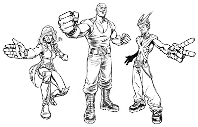 Here are the approved final pencils, complete with the new, happier Rock character. Most of the previous Paper, Scissors pencils were reused with just the addition of new hands...and a less 'squinty' version of the female's face.
8. FINAL INKS
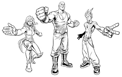 For some reason I thought inking these digitally was going to be a lot quicker. That would be true if I was inking in my rougher inking style, but for these they wanted a more polished inkjob. That didn't stop me though, and only after getting halfway through inking Rock digitally, did I realise I could ink these a whole lot quicker by hand. But 'waste not, want not', I used the digitally inked head and fist and traditionally inked the rest, merging them in Photoshop.
9. COLOUR
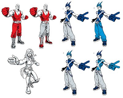 So as mentioned earlier, the original idea was to have each character with their own distinct Pepsi colour. Ideally, the less shades of colour used the better, so to achieve a more iconic look to the characters and to keep printing simple. So it was Red for Rock, blue for Scissors and white for Paper, with grey/silver being used as the secondary colour (skin, clothing etc.). This produced a great looked to the two male characters, but unfortunately Paper let the side down. Having only white and grey to use on her was somewhat limiting and she turned out a bit too bland. A shame really.
Due to the above problem, they decided to let me use any of the Pepsi colours and shades for the characters. I decided to make each characters' glove a distinct colour, as the glove and symbol was the most important element of the pic.
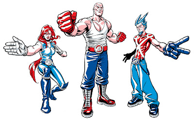 The original lighting setup was a bit too harsh and it was also too complex and detailed for something being printed so small. Also they wanted Scissors' shirt to be less skin tight which meant simplifying his torso muscles.
 So after simplifying the lighting and doing some little fixups, the artwork was vectorized in Illustrator using the Silhouette plug-in. Vectorizing the bitmap image allowed them to enlarge the artwork to whatever size they wanted without losing any of the line quality.
...and here's the finished result.

10. BROUGHT TO LIFE
Here's the television commercial with the characters. The rotoscoped animation was done by fellow Aussie artist, Andy Finlayson.
11. FINAL WORD
As far as character design jobs go, this ran pretty smoothly. So in that respect this tutorial didn't address all the hurdles an artist may face on this kind of job. But hopefully this helped outline the basic structure of the character design process.
Any questions, let me know.
Building a Wookiee
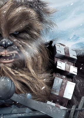
Here's a brief rundown from start to finish on how I created my illustration of Chewbacca using Cinema 4D R10, Zbrush and Photoshop. Some steps are more in-depth than others, and I won't be going into too much detail with the construction of various elements in Cinema 4D but you will see a step-by-step of the process starting from the initial roughs to the finished piece.
1. ROUGH IDEAS
The brief for this job was to illustrate any Star Wars character I wished (preferably a goodie, as most of the other artists participating were illustrating the bad guys). A Chewbacca portrait was suggested by the client, done in a similar vein to my Thing piece (see my 3D art gallery). This seemed like a fun and challenging direction to go. I can't say that Chewie is one of my favourite Star Wars characters, but the personal challenge was there to create something really cool and ideas were already starting to form in my mind.
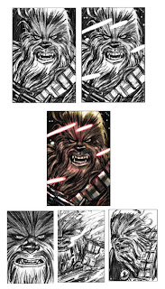
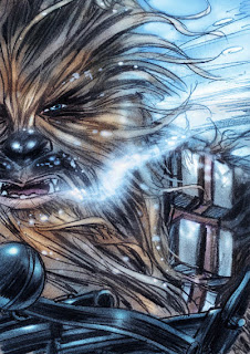
I submitted some rough designs, the colour version in the middle being my first preference. I liked the expression and the laser fire created a good opportunity for some dramatic lighting.
2. FINAL COLOUR ROUGH
They came back to me with a preference for the unique cropping of the Hoth scene, so the next step was to do a more refined colour rough for George Lucas to sign off on.
3. DECISIONS DECISIONS
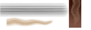
Once it was approved I had to decide how I was going to approach it. A 3D piece was originally discussed but my lack of knowledge in modelling with hair and the very tight deadline (less than a week) had me going down the road of a 2D digital piece done in a similar style to my MAD covers. But I couldn't shake the image of how great it could look if I made the extra effort of modelling it in 3D. So with that crazy decision and next to no knowledge of how I was going to create this 'walking carpet', I nervously stepped back into the realm of 3D.
Below- Abandoned experiments with hair creation in Photoshop.
4. CREATING THE HEAD
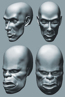
So after promising to get my head examined after this was all over, I began the 3d modelling process. I used a human head which I had previously modelled in Zbrush. I've also used this head in various other pieces in the past, such as the Pinhead, Warrior and Gnome Fisherman illustrations (see my 3D art gallery). Using photo reference of Chewie as a guide, I deformed, pushed and pulled the head in Zbrush, reshaping it to give it more Wookiee proportions. Also a quick texture was painted in Zbrush using Projection Master.
Below is a comparison of the original human head and the reshaped Wookiee head.
5. ADDING HAIR
This was the most stressful part of the whole job. Even though I'd used Cinema 4D a handful of times for various non-hairy projects, I'd never fully explored their hair creation plugin. Initially I thought it would just be a case of covering Chewie's whole head with one large mass of hair, then styling various sections to create the wookie's unique hairdo. WRONG!
I discovered I practically needed a hairdressing degree to work out the proper way to get it done. My own hair was getting greyer by the minute from the stress. The deadline was fast approaching and I was facing the frustrating prospect of having to dump everything and start all over again in 2D.
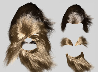
After a brief panic attack, I knuckled down to try and teach myself how to do it properly. I studied the photographs of Chewbacca, noting the different hair masses which made up his hairstyle. There ended up being about ten different sections of hair which had to be applied. I added the separate hair masses to the head mesh and then using gravity, styling, brushing, cutting and a virtual wind machine I made the hair do what I wanted. Not as easy as I make it sound, there were a lot of false starts and redos but I eventually got to a stage I was happy with. By the end of that, doing the torso with one large mass of hair was a walk in the park.
Here's the completed hair and also some of the individual sections.
6. PROPS, BITS AND BOBS
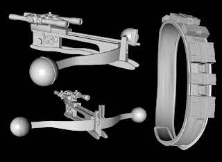
Now came time to add the eyeball, teeth, tongue, his bowcaster and his bandolier.
The eyeball was easy enough. A sphere with just a slight bulge for the iris was added. I could have taken the time to build a transparent lens on top of the sphere to create more accurate refractions and reflections on the eyeball, but considering that it would be mostly covered by hair and shadows and the lack of time, I decided against it.
The teeth were recycled from my previous projects. The main change was to just elongate the canines.
The Bowcaster was built from scratch in Cinema 4D, unfortunately I went a bit overboard and half the fine details I created, were cut off by the angle and the cropping of the final piece.
The Bandolier was fun to make. Gravity was used to form the main belt around Chewie's body and the small straps on the ammunition. The ammunition was just resized and reused across the belt. Minimum effort for maximum results. Things were looking up.
7. LIGHTS, CAMERAS...
Setting the camera was a bit tricky. For some reason I just couldn't get the perspective right and the camera was giving me a fish-eye lens effect where the spheres distorted into ovals. Turns out I was just pressing a wrong button or something. That's what happens when you learn as you go, I guess.
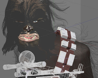
Originally with the lighting I was going to create an illuminated floor which would emulate the glare you get from snow-covered ground, but this just lit the face up way too much. I ended up using three lights, one for the sun, one as reflected light and one as underlighting to light up Chewie's eye area.
Here's the whole wireframe setup before rendering. As you can see the light grey rectangular area in the middle is the camera area, and everything outside of that looks pretty crappy. If you rotated the whole pic and viewed it from a slightly different angle, it would look terrible. Ironically this 3D piece was only ever going to work from one 2D viewpoint. No use building stuff that isn't going to be seen, right?
8. RENDER!
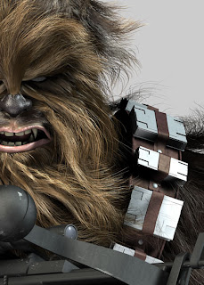
After a few test renders to make sure everything was working the way it was supposed to, I rendered it out at A2 which took waaaay too long for someone with an ultra short deadline. I was eager to get it into Photoshop to wrap things up.
The eye turned out a bit milky, but that was due to the eyeball being luminated to help it pop out of the shadows. Also there were heaps of stray hairs unnaturally intersecting objects which needed erasing. Below is the untouched render from Cinema 4D.
9. IT'S SNOWING!
In Photoshop, I fixed any mistakes, overlayed more textures onto the skin and lips and did some general brightening and colour adjustment. Now it was time to add the snow.
I wasn't too sure how to go about this. Eventually I came up with a very simple method. I found some hi-res textures of rusting metal and textured paper. In Photoshop I desaturated the image and bumped up the contrast until it was almost pure black and white. Then using the cloning tool with the texture on a separate layer, I painted the white clumps of texture onto another layer (which was set to 'Lighten') and this ended up being a pretty convincing snow texture.
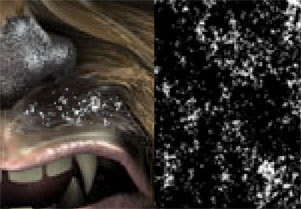
Finally the background was added. Since the Cinema 4D render had an Alpha mask included in the Channels, it was very easy to separate the main image from the blank background. The mountains were painted in Photoshop using photo reference and the snowstorm was basically clumps of motion-blurred noise.
As a final touch, noise was added to the whole picture to reduce the digital look and to give the piece a bit more texture.
I hope this rundown was helpful and insightful. If there are any areas I've missed or you want discussed in more depth, leave a comment and I'll try to answer your questions.
Thanks for reading.
All artwork © Chris Wahl 2010 unless otherwise stated. All characters are copyright to their respective owners