Penguins- Combining 3D and 2D
 In this tutorial I will explain how I combined three dimensional elements created in a 3D modelling program (in this case, Zbrush), and combined them with 2D painting techniques and texture overlays in Photoshop to achieve a hybrid of the two.
1. THE BRIEF
This was for MLC, a superannuation firm here in Australia. The idea behind the Illustration was to show a person's (in this case a penguin's) 'nest egg' growing with their particular super fund.
The company's colours, a gold and purply-blue were to be integrated into the colour scheme of the illo. So the snow and sky would both have a purply tinge to it, combined with the gold sunset.
2. THE ROUGH
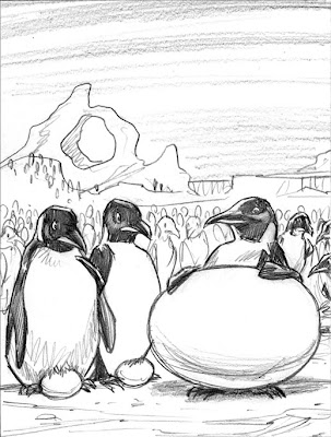 As always this job started with a pencil rough. They gave the go ahead without any changes, but their quick approval was to cause problems later on.
3. 3D/2D COMBO
The reason for combining the two approaches was to get the best of both techniques but without any of their time consuming elements. This was completed in a couple of days, so I didn't have the time to model and texture 3D penguins to the level of detail I wanted and I also wouldn't have been able to achieve this result just through 2d digital painting either. So a combination of the two seemed the best way to go.
4. ZBRUSH
The 3D modelling program I used for this was ZBrush (which technically is a 3D/2D program in itself). The basic shapes for the ground, eggs, ice formations and penguins were all modelled in this program. Usually in a 3D application the next step would be to add textures and assign bump maps etc to complete the 3D look, but as mentioned these bare models were just assigned lighting then rendered just as plain greyscale images and then exported to Photoshop for further work.
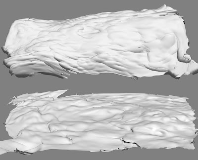 The ground (above) was modelled using a flat plane, which was assigned an alpha mask (this creates a mask based on a texture's greyscale intensity, darker bits are masked while lighter bits aren't) after some deforming I ended up with these snow scenes.
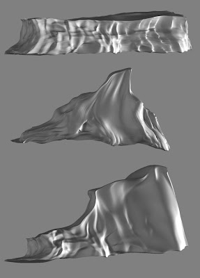 The ice formations started as 3D spheres, cubes and torus shapes which were then manipulated like clay (a trait that Zbrush is well known for) to achieve their particular looks.
The egg was a basic sphere slightly deformed to get the egg shape. I assigned the egg a simple eggshell material before rendering.
The lighting setup for rendering, used about four lights to achieve the bouncing of light on a snowfield.
5. INTO PHOTOSHOP
So in Photoshop I colourised and lightened the models to get the particular icy look I was after. On the ground I overlayed a grainy texure to emulate the texture of snow. I made sure I transformed the perspective of the texture to match that of the ground.
Another texture was overlayed onto the egg to give it more depth.
The sky was a simple gradient incorporating the company's colours. The clouds were airbrushed wisps in Photoshop which were stretch and distorted and then assigned an embossed layer style to give the underside lighting.
6. THE PENGUINS
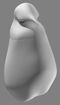 In Zbrush, a simple penguin shape was created using Zspheres. The same lighting setup was applied and it was exported to Photoshop. The seam around the chest area was cleaned up, then it was ready to paint.
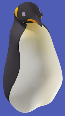 On a separate layer, colours were painted onto the shape below. With the layer set on overlay, this allowed the rendered shading to show through.
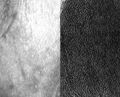 Scanned textures from photos of penguins were used as a quick shortcut to achieve a realism to the penguins. The constrast was increased on the greyscaled textures, and posterize was used to give the photo textures a slightly more painterly feel.
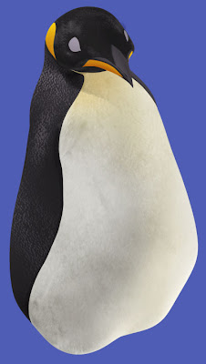 On a separate overlay layer again, the stamp tool was used to brush on the textures. Applying textures in Photoshop instead of a 3d program had it's pros and cons. The bad thing is I didn't have the textures contouring to the model's shape as they would in a 3D program, the good thing was I didn't have to created a seamless texture (which is what's usually used in 3D art) and in PS it was quicker to apply the texture where I wanted it. Once again the best results in the least amount of time was needed.
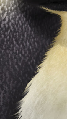 The little wisps of hair were created using Photoshop's smudge tool. To achieve a similar effect in a 3D program would have taken a hell of a lot longer.
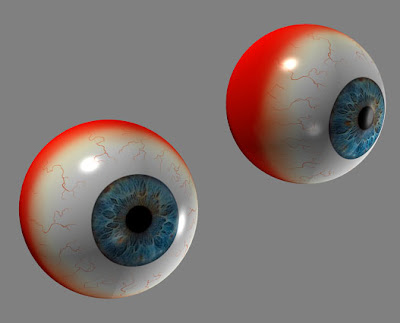 These eyeball I've reused time and time again for various projects. Back in ZBrush, I positioned the eyes in the rough position of where they might fit onto the penguin's face. This was then rendered and exported out.
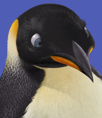 The eyes were just overlayed onto the painted eye portion, with a bit of shadow being added to make them sit more convincingly.
Also at this point I painted more detail into the beak, fixed up the shape slightly and overlayed a rough texture.
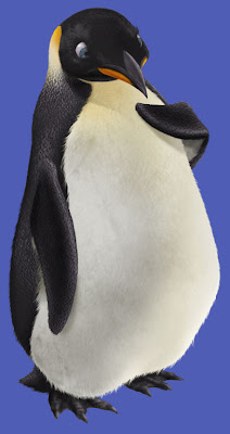 The flippers, feet, tail and shadows were added, all painted in Photoshop.
The penguin was finished.
7. CLONES!!
Luckily penguins all look pretty similar to each other. Creating twenty unique penguins from scratch would have taken forever, so using the first penguin, I cloned it making adjustments to each one (using the very useful PS liquify tool) to give them a little bit of their own personality (different eye colours, different shaped heads and bodies). Lighter and bluish tones were added to the penguins as they receded into the background (emulating the effect of fog and atmosphere.), this also helped to make the main characters 'pop'.
Shadows were created for all the eggs and penguins to make them sit more convincingly in their environment.
Finally a layer of noise was added to the whole piece to get rid of the digital feel.
8. THE RESULTS
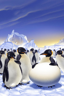 The first version sent through, followed the original pencil rough very closely. However they weren't keen on the ice arch, and wanted to exaggerate the expressions and poses more on the penguins, so some changes were made.
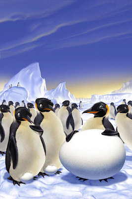 This is where the Liquify tool came in handy again. It was very simple to nudge the expressions on all the penguins, exaggerating them more where needed. Since everything was still on layers, the arch was removed, replaced by the mountain behind it which was enlarged and placed higher. Total time for all changes about 3 hours.
 They also requested a separate version with 99% of the background penguins removed so to place more emphasis on the main characters. Luckily I'd rendered all the ground around so some nice bits of snow ended up showing through. Also the clouds were removed to help the added text stand out more.
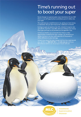 Here's how the final image appeared in print. They obviously no longer wanted the company colours in the piece, so they got rid of the purple and gold hues and gave it a more icy look. Turned out pretty good. It's just a shame that so much of what I added was taken out in the end.
Hopefully, this tutorial has shed some light on another aspect of my illustration work. Once again questions are always welcome.
6 Comments:
No questions here. Back to back Tutorials. you're spoiling us. :p
fantastic work.
-heri
I love how you seem to be able to create art in whatever style you want. Thanks for posting the tutorial.
This was rockin' What a great step by step. I'm glad I started coming to your site, so much exciting work to peruse, etc.
Thanks everyone!
Really great post, and I love the final result. Many thanks for sharing!
My sincere thanks to you Sir.
Post a Comment
<< Home